Saks Fifth Avenue – Product Filters
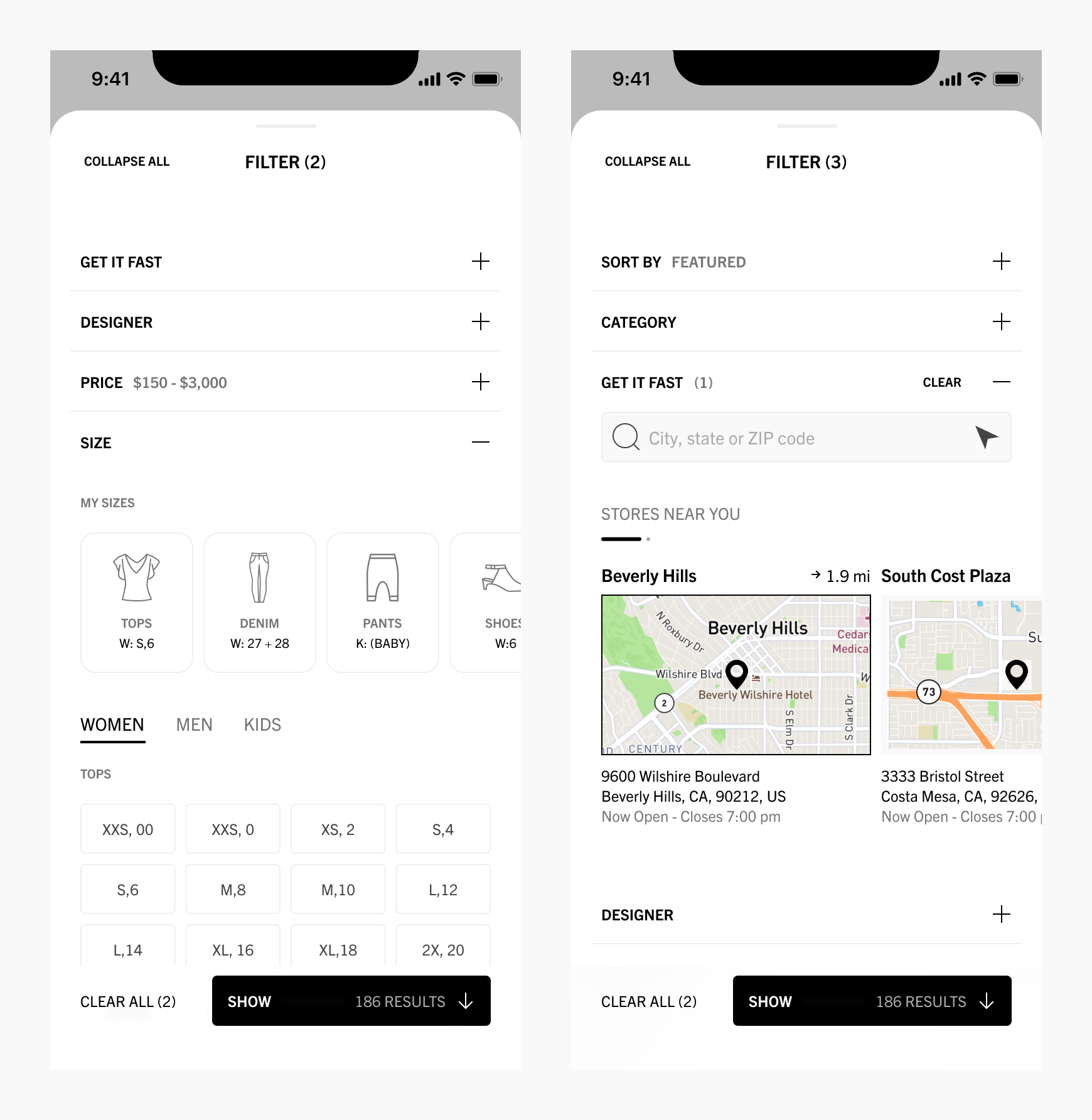
Saks Fifth Avenue is redesigning their entire app. I helped them with the overall direction for the Android app, but I also helped with iOS projects when needed. Specifally, the iOS team needed designs for filtering products by size and also location. You can see a few screens here, and I’ll walk you through the process below for the Filter by Size screens.
Research
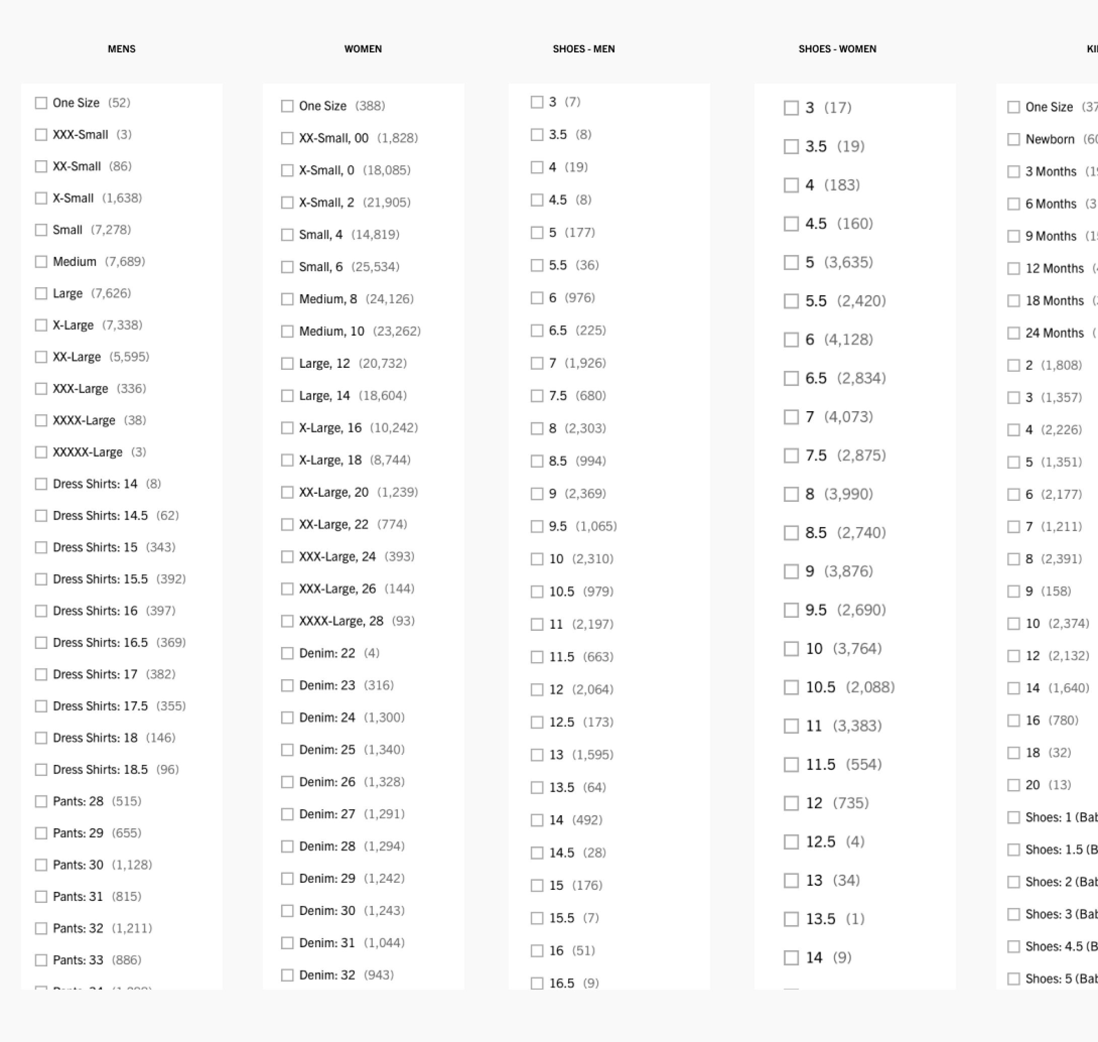
I took inventory of the current Saks app product & size hierarchy. I also met with project managers and the team responsible for handling all product data.
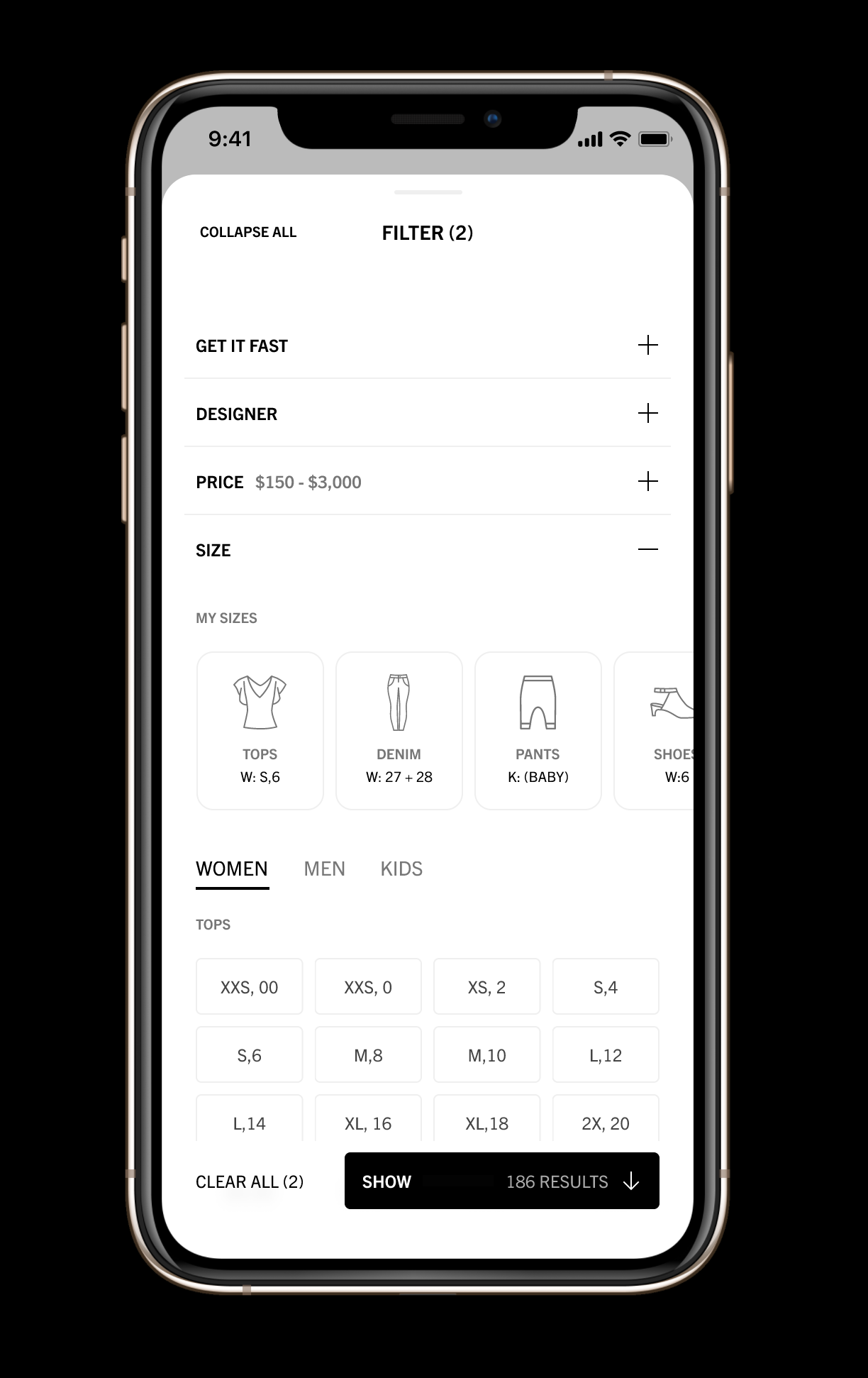
While researching Saks current sizing information hierarchy, I also saw how we could simplify our design elements. Specifically, I ended up using abbreviations (ex. XL instead of X-Large). I also suggested we remove the parenthetical number of items available per size. These changes helped create a more minimal tagging system that made better use of screen real-estate. It also helped the team as we continually explored how tags (such as size) interacted with other tags (such as color). By removing the available item count, we not only improved tag readability, but also provided a more flexible system for development.
Reference
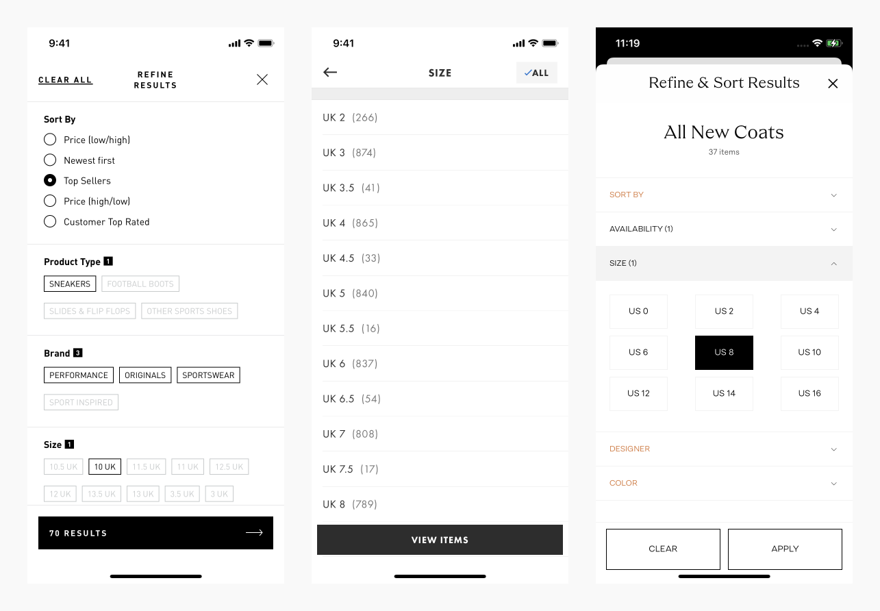
Next I gathered inspiration from other e-commerce apps on my iPhone and also from mobbin.design. I always like to see how competitors are solving problems, but I also frequently explore other sectors to find new ideas.
Mockups
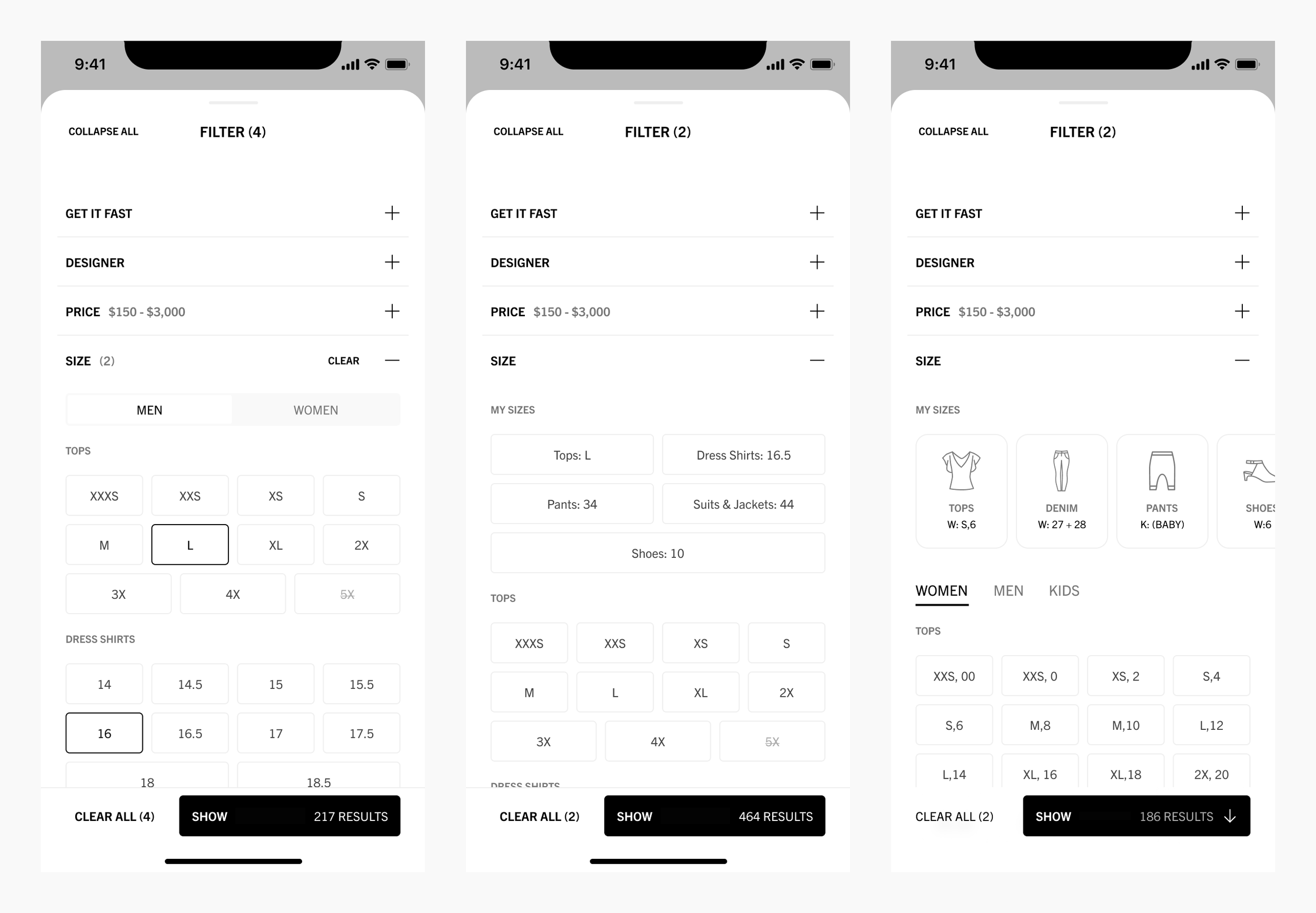
I then got to design. I’m a very iterative designer. I create as many versions for myself as I can in order to visualize and think through through all sorts of design challenges with layout, typography, content and interactions. While I created many more versions than seen here, I usually decide on about 2-4 options to present during design reviews.
Final Prototype
One of my close friends who is an art director at another company recently told me about her design presentation strategy she calls mild to wild. I’ve been doing this for years, but never had the terminology for it. Basically, the mild solutions are fairly conventional and safe whereas the wild solutions might take some creative risks.
For example, in my reference phase, I had not seen a use of icons in the filter by sizes sections. I didn’t anticipate this would be the final choice, but I thought it was worth a shot. I animated the My Sizes carousel in Figma and presented it to the team in the best possible light. Project Managers and other Designers really liked the playful approach and the “wild” version ended up being the direction we eventually decided upon.
I hope this gives you some insights into my design process, and I appreciate you for taking the time to learn about my work.